Great brands
don’t just happen.
Great brands don’t just happen.
They require focus. Focus not on one thing, but on everything. That’s because everything matters. Everything you do, everything you say, everything you create. It all matters. Every interaction is an opportunity to build our brand. So it’s important those interactions are consistent and compelling. That’s where an online guide can help. Use it to better understand our brand and reflect it in all that you do and all you create. Great brands need help from great people like you.
Brand Foundation
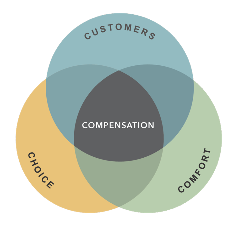
At Flexsteel, we believe a thoughtfully designed home helps people fully enjoy their everyday lifestyle. We measure each action we take by our commitments. This is how we deliver our promise. Today. Tomorrow. Every day. We’ve got this, so you can focus on the moments that matter most. No matter how simple or complex, we help you make the most of your spaces and transform a place into a home.
Improving Everyday Lifestyles
We handcraft exceptional products intended to be enjoyed by future generations because we believe lasting beauty and comfort improve everyday lifestyles.
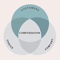
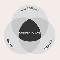
Customers For Life
We deliver a better experience, from the way we handcraft our furniture to the promises that back it.
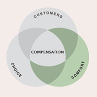
Comfort That Lasts
We have over 120 years of experience pioneering comfort for everyday lifestyles.
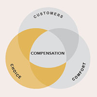
Choice For Everyday Lifestyle
We make it effortless for customers to get exactly what they want—no matter their lifestyle needs.
Compensation That’s Easily Won
We design products to last, making life easier for our retail partners and customers.
Increasing customer retention rates by 5% can increase profits by 25% to 95%.
– Harvard Business Review
Customers For Life
- We use the voice of the customer and focus group research to guide our product development.
- We guarantee everything we make with a superior warranty, ensuring our customers’ return on investment.
- Our products are made in North America, resulting in more manageable lead times and higher quality standards.
Millennials have been dubbed “the wellness generation” with 53% making it a daily, active pursuit.
– Stanford Health
Comfort That Lasts
- Our innovation began with the Blue Steel Spring™—a revolutionary ribbon of steel that provides unmatched support and never needs replacing.
- We’ve evolved to include other technologies that further enhance well-being, such as our Zero Gravity and Triple Power recline features.
80% of consumers are more likely to purchase when brands offer experiences that are personalized to them.
– Epsilon
Choice For Every Lifestyle
- We offer a wide variety of design styles and furniture options for every room.
- We accommodate any buying preference from select options with immediate availability to completely customized looks.
- We provide an extensive selection of life-friendly fabrics, including our exclusive Kashmira brand, so customers can choose performance features based on their needs.
Customers will pay a 16% price premium for great customer experience.
– PwC
Compensation That’s Easily Won
- We help you cultivate long-term customer relationships by providing you with a well-designed merchandising program, visualization tools, and exceptional customer service.
- We provide more options and cross-selling opportunities for you with a wide selection of styles for every room with lead times and finish options that support every customer buying preference.
- Our superior product design, construction, and warranty coverage generate higher commissions with lower returns—resulting in more money in your pocket.
Why Flexsteel
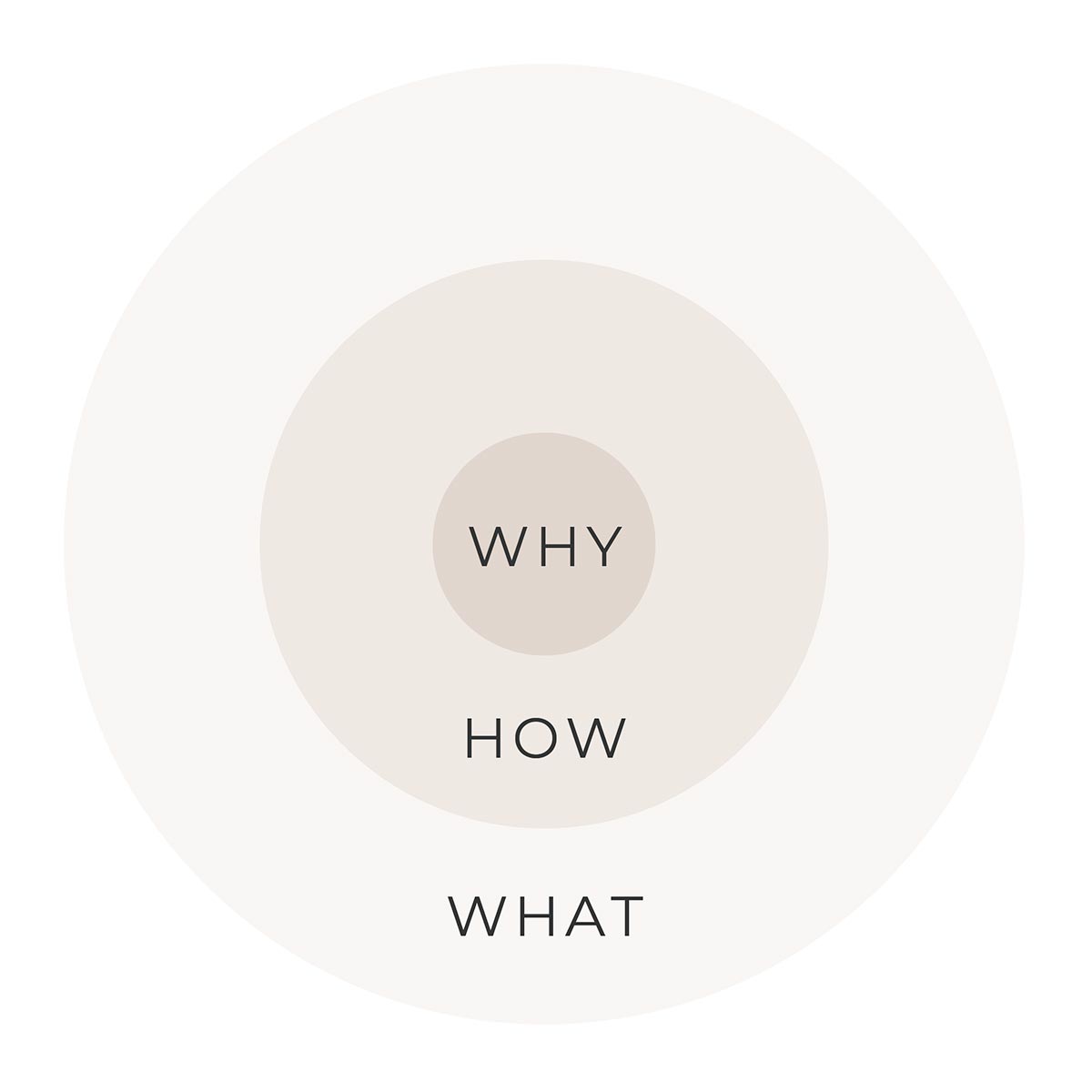
It is a false assumption that differentiation happens in HOW and WHAT you do. Simply offering a high quality product with more features or better services or better price does not create difference. Differentiation happens in WHY you do it.
SIMON SINEK
What
For more than 120 years, we’ve dedicated ourselves to the relentless pursuit of ultimate comfort.
How
We combine perfected processes, patented technology and the best materials to deliver a lifetime of comfort and support.
Why
Because we believe that lasting beauty and comfort improves everyday lifestyles.
Brand Identity
Logo
Primary Lockup
The primary lockup consists of the main logotype. The logo color should never stray from the approved color palette. The main logotype should primarily be used in the Flexsteel Charcoal. White may be used when applicable. The primary lockup should always be shown in one color. A registered trademark symbol follows “Flexsteel”.
PRIMARY LOCKUP
Program/Sub-Brand Lockup
Flexsteel programs/sub-brands should be displayed following the Flexsteel primary lockup style. Progam names should be in Trade Gothic LT Std – Extended font and spaced out appropriately to match the primary Flexsteel logotype. Program names should be shown at 70% of the size of the Flexsteel logotype and should primarily be left aligned. Center alignment may be used where appropriate, such as webpage headers, Powerpoint Title pages, etc.
PROGRAM LOCKUP
Tagline Lockup
The Flexsteel tagline should be displayed in one of Flexsteel’s approved fonts when used alone or alongside the Flexsteel primary lockup. The font used to display the tagline should follow the primary font used in the material being developed.
Use Examples: Video screens which use Montserrat San Serif font should display the tagline in Montserrat to match the video style. Print materials that use Flexsteel’s expressive font Quincy may utilize this font for the tagline to match the material style.
In no instance should the tagline be displayed in an unapproved font style.
TAGLINE LOCKUP
Social Media Profile Lockup
The solid square or circle lockup with a condensed logotype is approved only for social media profile picture use.
SOCIAL MEDIA LOCKUPS
Primary Logo Usage
Sizing & Clear Space
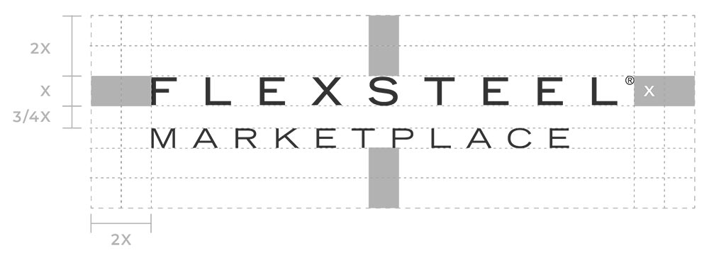
Generous clear space guidelines prevent the logo from appearing too close to other objects, images, or margins.
The unit “X” is based on the height of the logotype from the top of “F” to the bottom.
The clear space surrounding the lockups is a minimum of “2X.” The only exceptions are for the logo on the flexsteel.com navigation menu, for use in social media profile images and for program/sub-brand lockups.
MAIN LOCKUP
Unapproved Usage
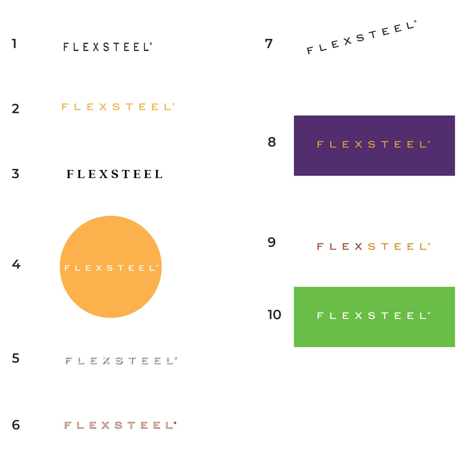
The Flexsteel logo should not be adjusted or transformed in any way other than what is approved in the guidelines.
- Do not expand or decrease the width of the logomark or logotype. All distortion should be avoided.
- Do not change the color of the logotype unless specifically approved by Flexsteel’s brand team.
- Do not change the typeface of the logotype. Do not add unapproved taglines to the logo or remove the registered trademark symbol from the logotype.
- Do not change the scale, proportion, or shape of the logo.
- Do not add a shadow or other effects to the logo.
- Do not apply a stroke to the logo.
- Do rotate the logo.
- Do not use incorrect variations of the logo on an unapproved background color.
- The logo should never have more than one color.
- The knockout logo should only be used on Flexsteel approved color backgrounds.
Program/Sub-Brand Usage
Sizing & Clear Space
The placement of Flexsteel program/sub-brand logotype should be 3/4 X vertical distance from the main logotype.
PROGRAM/SUB-BRAND LOCKUP
Brand Colors
When creating the Flexsteel brand color palette we considered legibility concerns, color psychology, color trends, and our competitive landscape. We have refreshed the brand by interjecting a brighter and more modern color palette. These fresh and friendly hues boldly express the Flexsteel brand attributes today with ultimate flexibility and usage.
Primary Colors
Neutral Colors
Expressive Colors
Fabric Line Color
Flexsteel’s fabric lines are each assigned a brand color that is used to distinguish the lines. When appropriate, each fabric line should be coordinated with its brand color.
South Haven: Flexsteel Sky
Latitudes: Flexsteel Spring
Custom: Flexsteel Goldenrod
FABRIC LINE COLORS
Color Spectrum
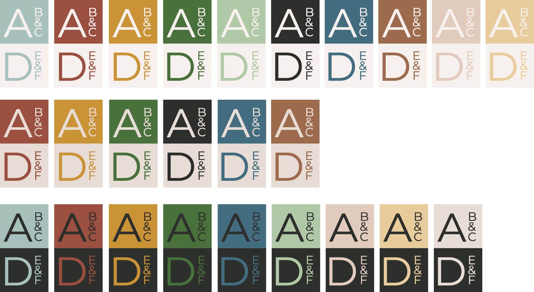
Simple Expressive Color Combinations
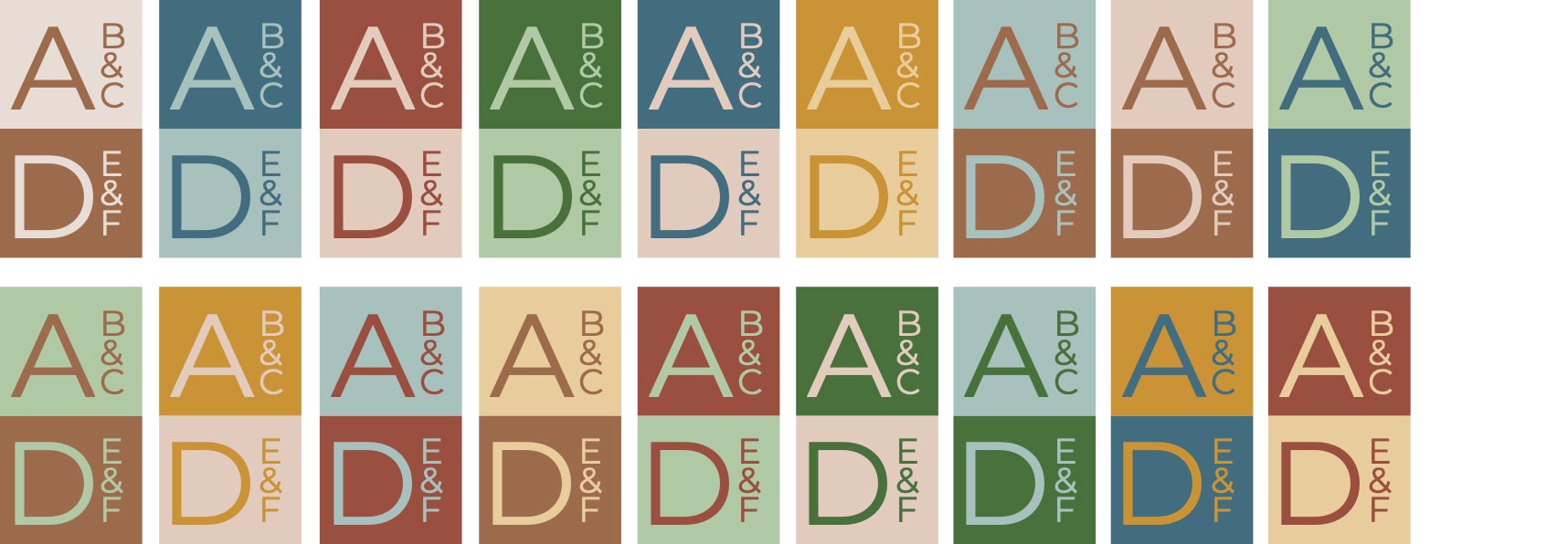
Dynamic Expressive Color Combinations
Brand Fonts
Type has personality. For Flexsteel, picking the right typefaces meant picking ones that best express the at-your-service attitude and friendly, approachable personality expressed by Flexsteel members. These fonts are the foundation for Flexsteel’s brand communications materials. You’ll see them in catalogs, brochures, and more.
Primary Brand Font
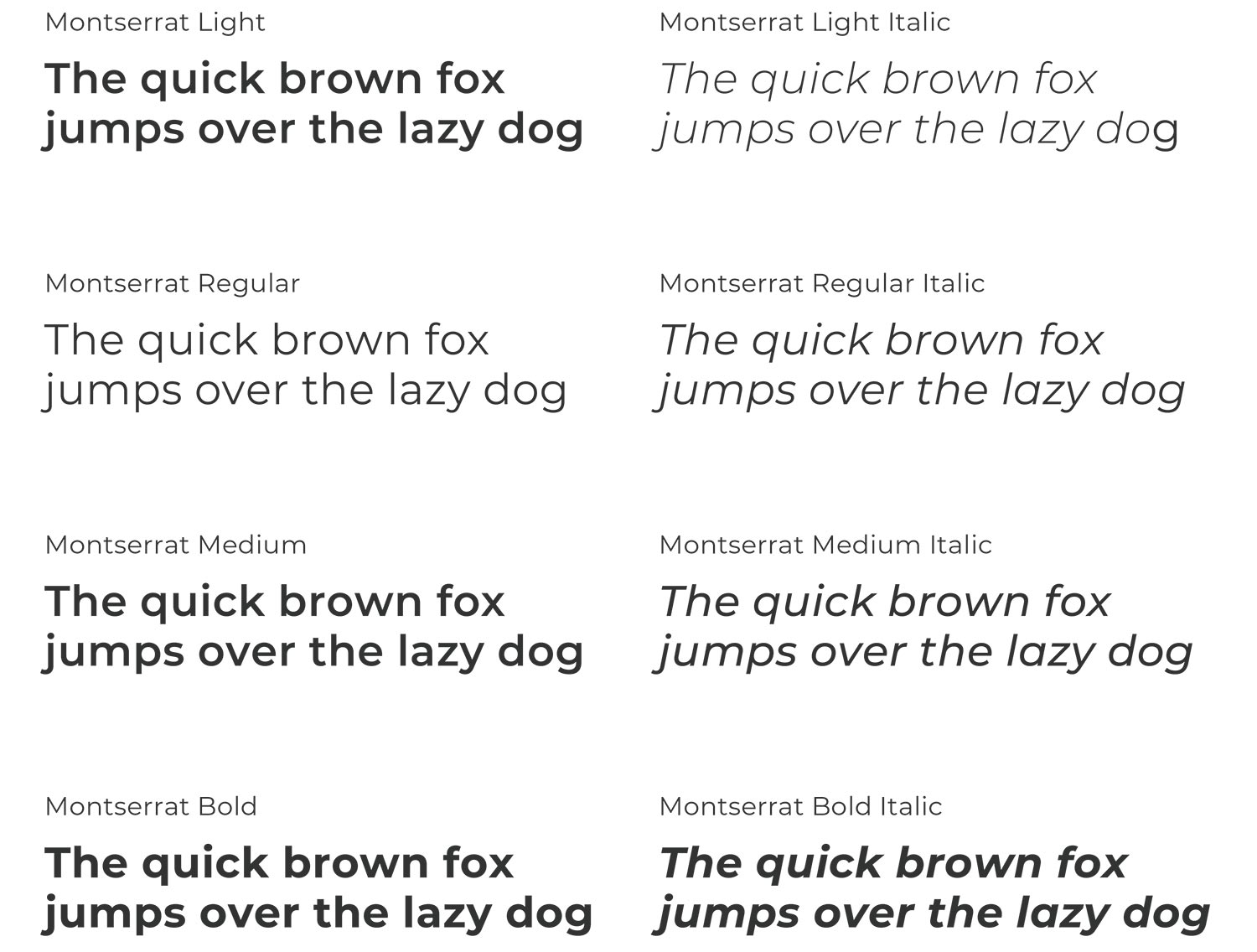
Montserrat
Montserrat is a geometric sans-serif typeface designed by Julieta Ulanovsky. Montserrat is very versatile and can be used in multiple domains such as websites, the publishing world, branding, editorial, logos, print, posters, etc.
Primary Brand Font – Web Alternative
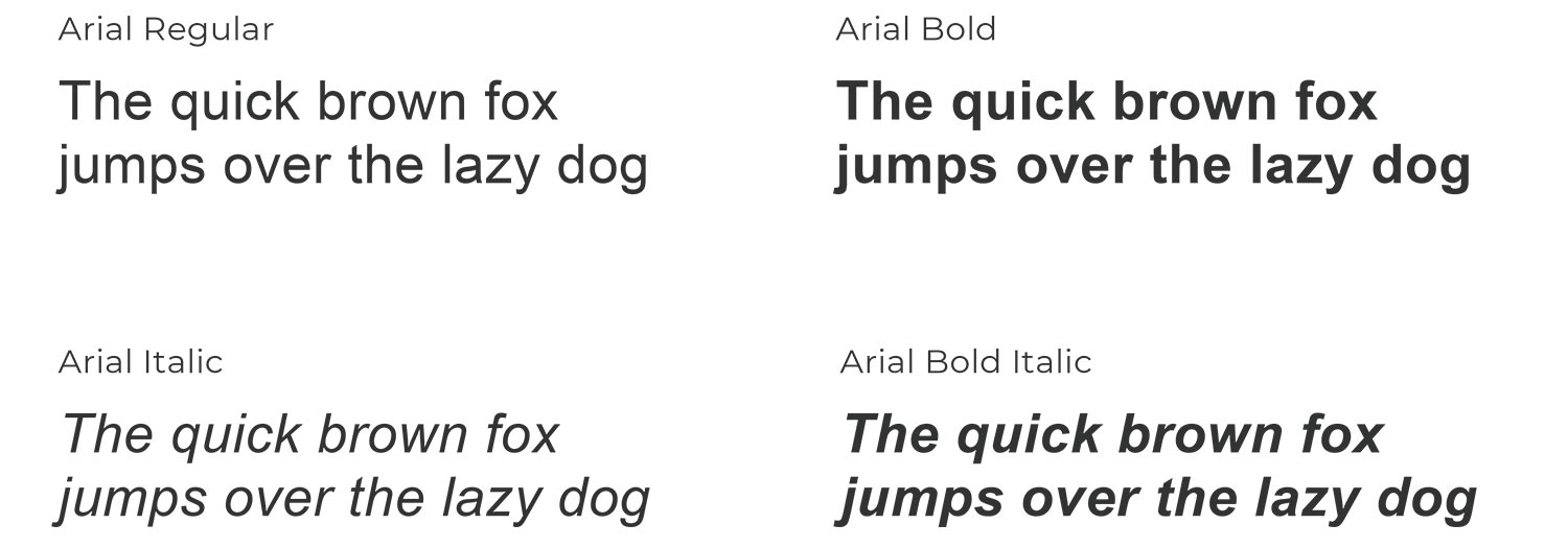
Arial
Arial was designed for Monotype in 1982 by Robin Nicholas and Patricia Saunders. A contemporary sans serif design, Arial contains more humanist characteristics than many of its predecessors and, as such, is more in tune with the mood of the last decades of the twentieth century.
Expressive Brand Font
Quincy
Quincy’s warm letterforms and medium contrast give any text a smooth, flowing motion. Small variations and human touches add charm, with Quincy’s boldest weights working especially well as large and medium display type.
For font download requests contact Flexsteel Brand Team
Expressive Brand Font – Web Alternative
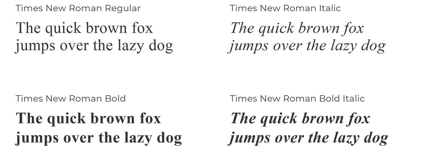
Times New Roman
Times New Roman is a serif typeface commissioned in 1931 by the British newspaper The Times. It was conceived by Stanley Morison, the artistic adviser to the British branch of the printing equipment company Monotype, in collaboration with Victor Lardent, a lettering artist in The Times’s advertising department.
Brand Type
Font styles and sizes
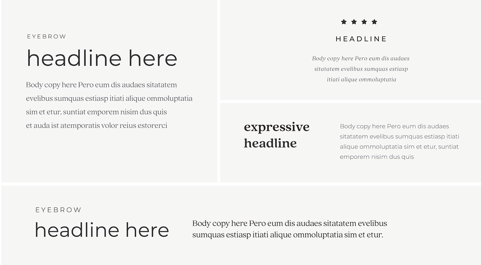
- Text color should be Flexsteel Charcoal for headlines.
- Body copy text can be black or medium gray.
- Brand approved color may be applied to headings and subheads when appropriate.
- Use sentence case, except for product names and proper names.
- When used in a sentence form, the “F” in Flexsteel should always be capitalized.
- All type should be left-aligned. Refrain from right-aligned text.
- Hang bullets so all type aligns left (this means bullets will hang in the gutter space).
- Use a full line space between paragraphs.
- Expressive font should be used only in short copy.
- The space after headings should be a full return of the heading type size.
- In most cases, all text should align with the baseline of the “F” in Flexsteel.
Print font style examples
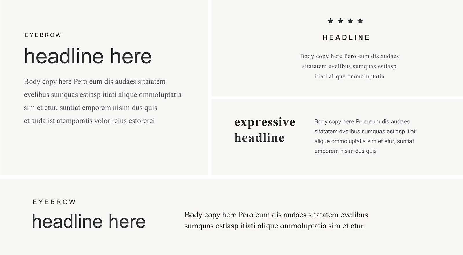
Web & PPT/Word font style examples
Email Signature
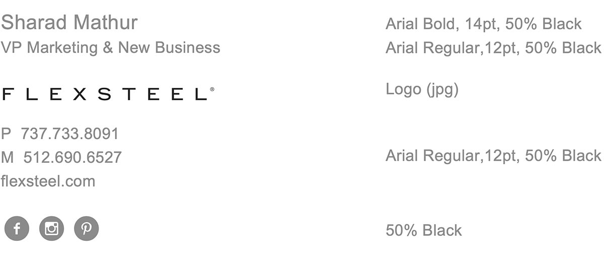
Everybody appreciates nice stationery, but today most of us send a lot more emails than letters. Consider a clean, friendly email signature as the email equivalent of that beautiful stationery set. It makes an impression in its own right, and when you use the appropriate email signature, it reflects well on the Flexsteel brand.
Font
Arial, Regular & Bold
Links
Name to email
Logo to flexsteel.com
Social media icons to Flexsteel profiles for respective social platforms (Facebook, Instagram, Pinterest)
Example
Mobile Devices
In addition to the Outlook signature, it is also expected that we utilize the email signature for our mobile devices. Follow the steps below after installing the Outlook email signature to your computer:
- Send a new blank email message to yourself
- Open the email message on your mobile device(s)
- On your mobile device(s), double tap your email signature > “select all” > “copy”
- On your mobile device(s) go to Settings > Mail > Signature > Paste your signature.
Stationery + PPT
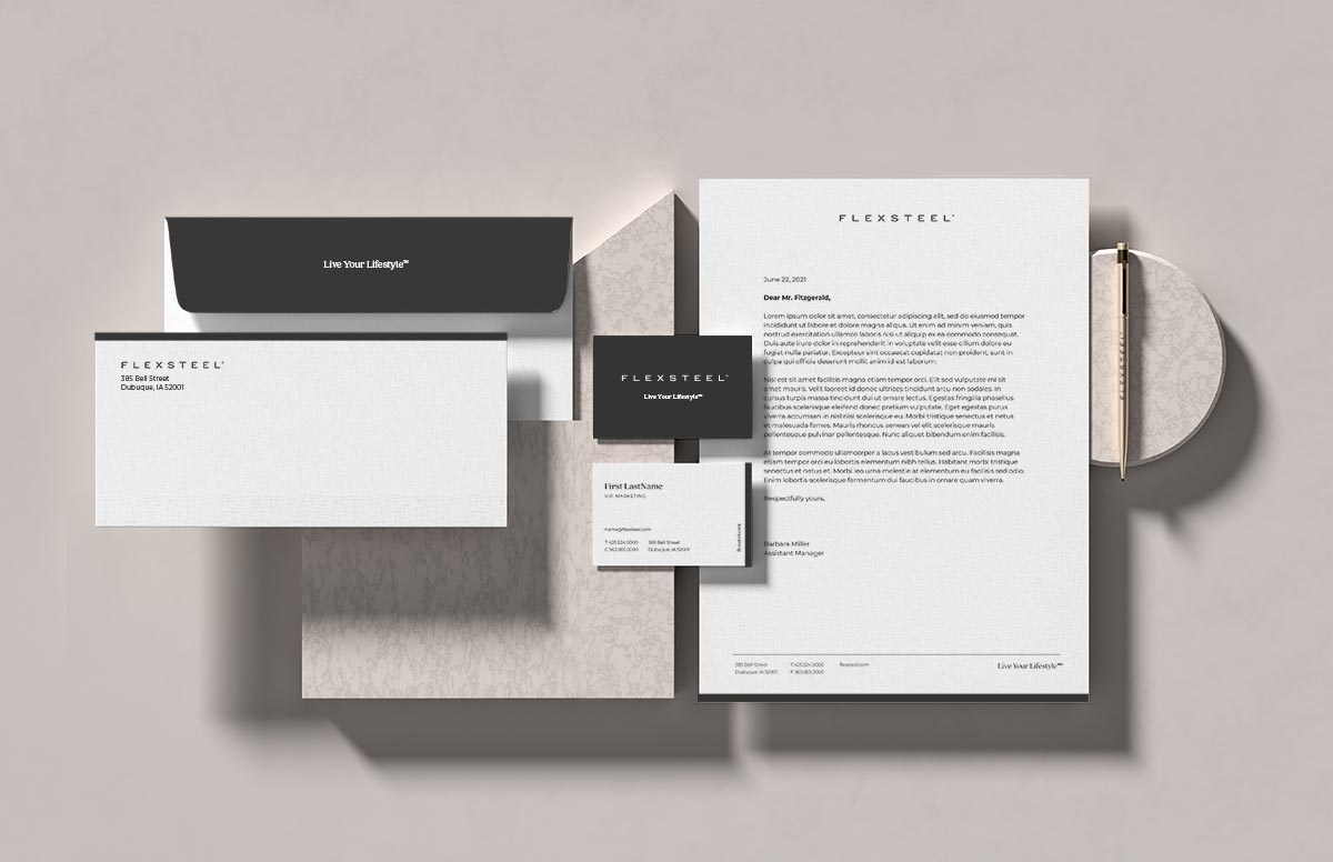
It’s all about consistency when you’re building an effective brand. This is especially true when using more formal communication tools, such as stationery, business cards, and presentation materials. Be sure to use Flexsteel branded templates to help create a recognizable and memorable brand experience for those who come in contact with us.
Letterhead
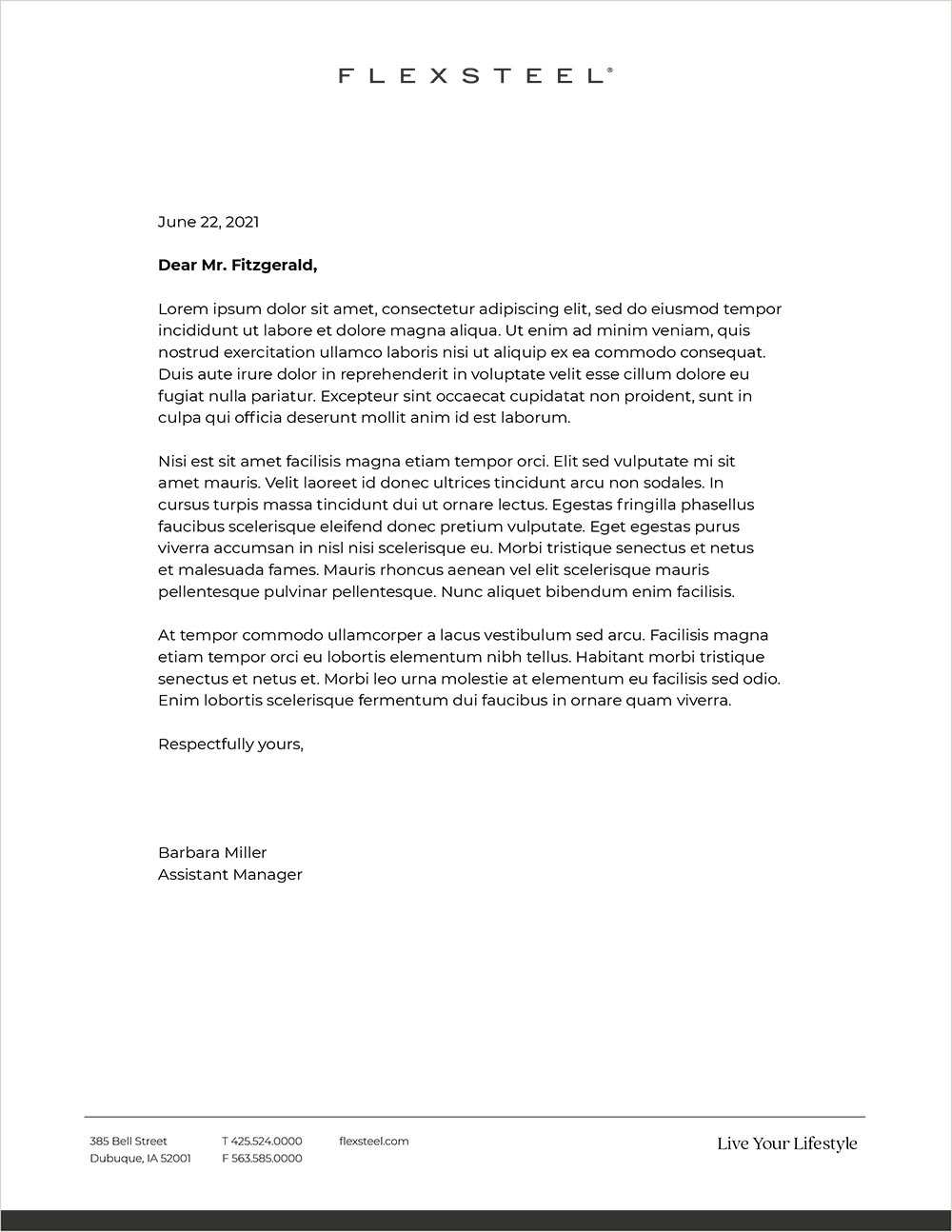
To maintain a consistent look and feel across all Flexsteel brand communications, Word templates are included in the Flexsteel Brand package.
Business Cards
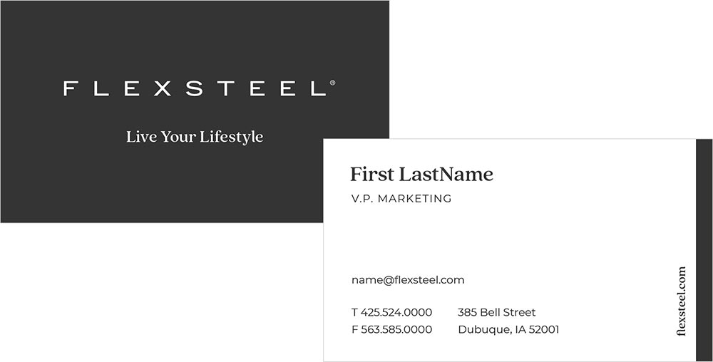
Business cards are used for all official contact and communication of Flexsteel members. This shows the approved layouts with the primary elements for the front and back side of the business card.
PowerPoint Template
Using the template slides created for Flexsteel, you’ll be able to create Flexsteel branded electronic presentations in PowerPoint. In Flexsteel’s PPT template, the approved web fonts should be the only fonts used. If you encounter a scenario that calls for a solution other than what’s available, use the same font weights and styling as previous template pages to maintain a consistant feel across all presentations. Any significant changes to fonts or colors need to be approved by the Flexsteel brand team.
Brand Voice
Just like you get a sense for a brand through the way it looks, you can also understand a brand through the way it sounds. A brand voice is a tool that guides the style in which we write and say things. When used correctly and consistently, our brand voice allows us to create a familiar connection to our audiences. Our voice should be applied across everything we write.
To achieve the Flexsteel conversational tone of voice, always ask if what we’re saying is:
- Bite-Sized
Are we avoiding information overload?
Did we explain a product’s benefits—rather than just listing its features? - Helpful
Are we clearly and quickly getting to the details that matter and helping customers make informed decisions? - Understanding
Do we showcase how our products improve everyday lifestyles?
Writing Do’s and Don’ts:
| DO THIS | NOT THIS |
|---|---|
| Be benefit-focused. | Be feature-focused. |
Write like you talk:
| Write like a robot.
|
| Use short declarative sentences. | Use long run-on sentences that go on and on … |
| Use relatable words like “storage”. | Use industry jargon like “casegoods”. |
| Talk with an active voice. | A passive voice is how we talk. |
| Talk with customers. | Talk at customers. |
| Stand for something. | Be everything to everybody. |
| Be naturally clever and in good taste. | Force a punchline for the sake of being funny. |
Brand Tone
Positioning Introduction
Exuding Effortless Charm
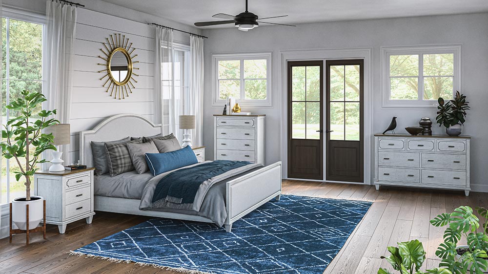
Create an inspired, relaxed retreat full of coastal cottage charm with the Newport collection. Designed to bring a calm, casual elegance to bedroom spaces, Newport furnishings combine vintage-inspired details, such as distressed two-tone finishes and scalloped edges, with modern features like integrated power for added functionality. A beautiful, weathered look veils the exceptionally well-crafted construction that’s built to last for future generations. With a range of bed size options and coordinating storage solutions, the Newport collection’s smaller-scale design will make the most of any size bedroom.
Product Details
Nostalgic Meets Chic
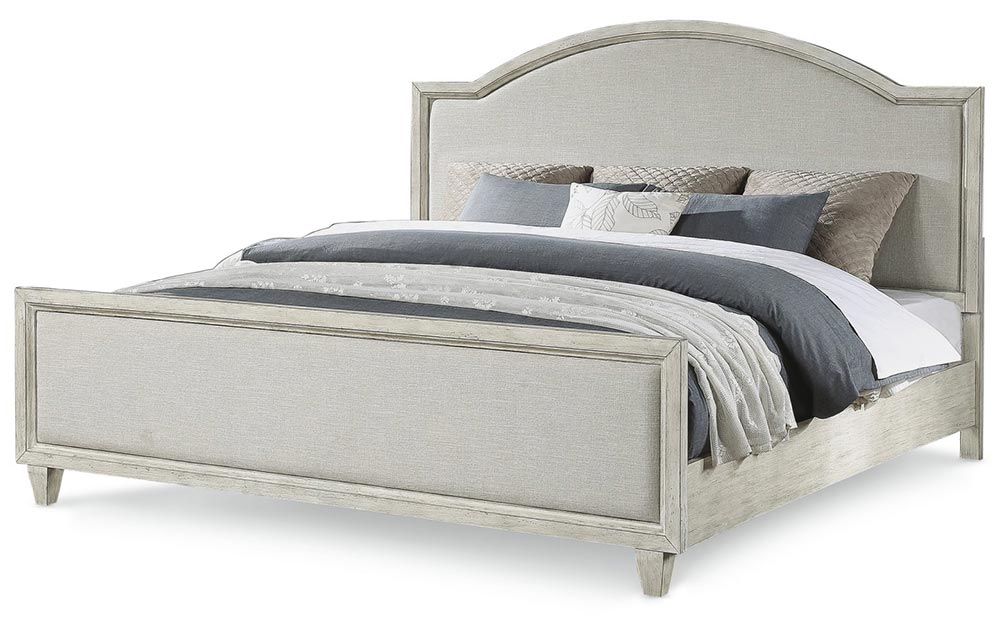
Drift away in relaxed elegance with the Newport bed, featuring an upholstered headboard and footboard in a graceful, scalloped profile. Available in sizes from full to California King, the bed’s cottage chic styling showcases a distressed, chalk paint finish for a vintage heirloom look. The bed is smaller-scaled to perfectly fit in any size bedroom.
- Coastal cottage style
- Crafted with oak veneers and poplar solids for beauty and durability
- Two-tone, distressed-look finish provides a bright and cozy aesthetic
- Square, tapered legs offer understated style
- Small-scale piece perfect for compact spaces
Nostalgic Meets Chic
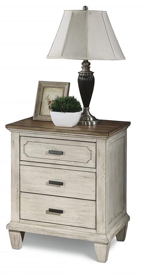
Bring the ultimate in convenience and comfort to your place of rest with this charming nightstand that stores all your bedside essentials. Outfitted with two roomy drawers, the Newport nightstand also features integrated power to keep unsightly cords concealed. A bright, weathered finish, accented with a scalloped top drawer detail and contrasting gunmetal pulls, complements the Newport bed with a coordinating coastal cottage look. A small-scale silhouette makes it a perfect fit for any size space.
- Coastal cottage style
- Crafted with oak veneers and poplar solids for beauty and durability
- Two-tone, distressed-look finish provides a bright and cozy aesthetic
- Square, tapered legs offer understated style
- Features gunmetal finished pull hardware for a striking contrast
- Planked top with burnished edges adds a vintage look
- Three drawers on ball-bearing glides provide ample storage that’s easy to access
- Felt-lined top drawer protects contents and keeps them in place
- Two integrated outlets and USB ports keep cords hidden and out of the way
- Small-scale piece perfect for compact spaces
Imagery
All Flexsteel imagery should reflect the design and creativity behind the products we offer. It conveys the personality of our company through memorable storytelling, point of view, product arrangement and inspiration.
The camera angle will take the perspective of someone walking into the space. Styling elements should reflect a lived-in feeling, an artful collage of objects and textures, and subtle / realistic window views. Authenticity is key, so imagery should allow the viewer to identify with each setting. Keep the focus on the product, and the backgrounds free of distraction. Maintain a consistent tone from image to image, showcasing inspiring spaces with refined architectural finishes and details.
Environments
Format
It is important to know how images will be used. How will people see them? In an advertisement? In a catalog? On a website? Will there be text used with the image and where will its placement be? The format (vertical, horizontal) of each shot must be planned with the final usage in mind.
Lighting & Shadows
Images should feel as natural as possible with natural light in every shot. To achieve realism, the use of directional lighting and shadows to show depth are desired.
Angles
The majority of Flexsteel environment images are taken from an eye-level perspective. Doing so adds a sense of believability to the space. However, when appropriate, photos can be taken from high and low angles to add impact and drama.
High Angle
A high camera angle is preferred if an overview of a furniture grouping is needed, or if the details of the piece are not easily seen from eye-level.
Low Angle
A low angle adds a dramatic quality to the photo and accentuates details of a product that an eye-level or from-above view does not. Use this angle sparingly, but as needed.
Props
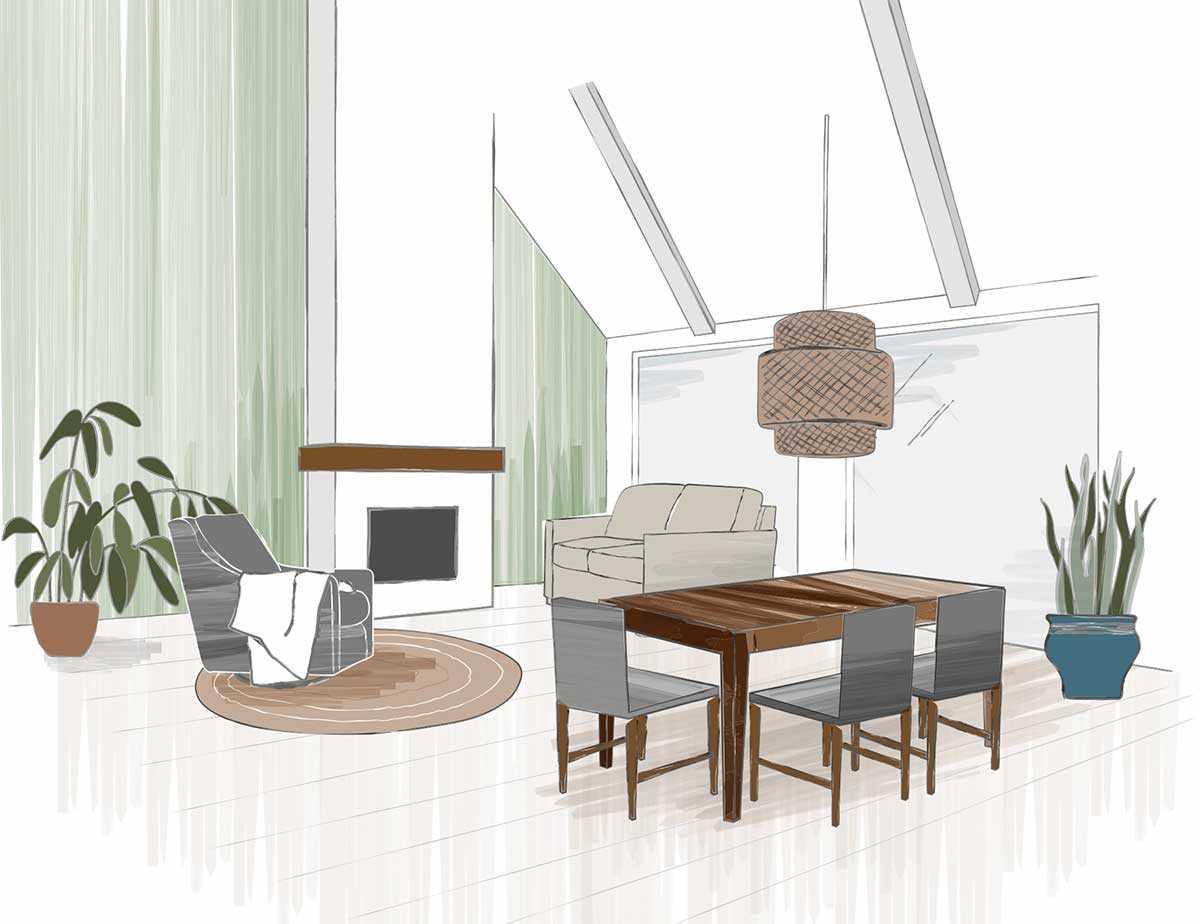
Meaningful props, which support the lifestyle and story being told in the rendering are required. Propping should reflect a “lived-in” presence. Props should support, not detract from the furniture / environment story and should be sophisticated, clean, contemporary and not trendy, communicating an appreciation for good design in every aspect (architecture, artwork, pillows, blankets, etc.).
Flooring
In our images — open, airy, optimistic, clean and sophisticated — flooring shouldn’t “weigh” down the product. It should allow the product/space to look beautiful. A range of flooring options are acceptable to increase the belief that the space is real. Wood, concrete, and contemporary carpet selections are preferred. We also use area rugs in images, which serve two purposes: (1) to define a space, and (2) to enhance the décor.
Windows
Windows should show realistic outdoor environments with slightly desaturated color and detail. The focus should not be on what’s outside.
Lights
Decorative lighting defines space and supports the desired atmosphere.
Computer Equipment
Always use Apple computers. Final images should have all branded marks removed.
Details
Detail shots are used as a supporting image near or next to a shot of the full product. Hero detail images should highlight the intersection between the function and beauty of our products. At times, detail images will be used in the place of white sweep images to better showcase the product and maintain perspective. Creative angles can be used to capture the desired shot.
Lifestyle Imagery
Our lifestyle photography represents our brand with a distinct look and feel that provides context, creating an emotional connection with our audiences. It provides an inspiring narrative that helps potential customers better envision themselves with our products.
Propped White Sweeps
Props are used to add meaning and provide context to the product. They also provide a sense of scale. Select timeless props that fit in with the style of the furnishings.
Unpropped White Sweeps
Unpropped images are also necessary so that the design details of the furniture can be the focal point.
Illustrations
An illustration is a simple graphic representation used to enhance communication. Illustrations represent anything from actions to objects and are commonly used to create infographics.
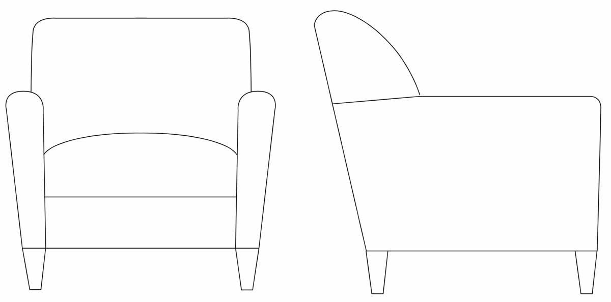
Product Line Art
Technical line drawings can be used to communicate the product category and statement of line. Front and side views are preferred. Isometric styles can be used to better communicate the product if necessary. Line art should be sized consistently and proportionately to each other. Statement of line illustrations should use a 1pt line weight.
Icons
An icon is a simple graphic representation used to enhance communication. Icons represent anything from actions to objects. Flexsteel icons are always flat and simple, consisting of one brand approved color.
General Use
Furniture Categories
Video
Approach
Videography is one of the best opportunities to convey the personality of our company. A good video sets the stage to tell a story, keeps people’s attention, and evokes emotion—creating an experience that the viewer remembers.
Process & Best Practices
Key steps take place in each phase of video production, and the unique and creative techniques videographers employ can vary. During the planning and development of each phase, it’s important to understand how the Flexsteel brand will be conveyed in the final deliverable. The following best practices will help keep videos consistent and on-brand.

